Graphs are being used to skew data & spin narratives like never before.
Especially on social media...
One graph from a less-than-reputable source, can spread a false narrative in seconds.
So let& #39;s take a look at the MOST common misleading graphs now & how to spot them!
 https://abs.twimg.com/emoji/v2/... draggable="false" alt="⬇️" title="Pfeil nach unten" aria-label="Emoji: Pfeil nach unten">
 https://abs.twimg.com/emoji/v2/... draggable="false" alt="⬇️" title="Pfeil nach unten" aria-label="Emoji: Pfeil nach unten">
 https://abs.twimg.com/emoji/v2/... draggable="false" alt="⬇️" title="Pfeil nach unten" aria-label="Emoji: Pfeil nach unten">
Especially on social media...
One graph from a less-than-reputable source, can spread a false narrative in seconds.
So let& #39;s take a look at the MOST common misleading graphs now & how to spot them!
In most cases, the baseline for a graph should be 0.
But people can skew how data is perceived by making the baseline a different number.
This can make differences in the data look much bigger or smaller, like below.
Expanding or compressing the scale of a graph can make changes in data seem more or less significant.
This misleading tactic is basically the opposite of omitting the baseline.
They& #39;re basically stretching the graph so the data is meaningless.
People may only include certain data points on their graphs to reinforce their narratives or create a false narrative.
When only a certain chunk of data is included in a visual is also called improper extraction.
The type of graph you use should depend on the type of data you want to visualize.
Using the wrong type of graph can skew the data & people will sometimes use the wrong type of graph on purpose to mislead.
But most of the time, this is an accident.
Over time, we have developed standards for how data is visualized.
Flipping those conventions can make a graph very misleading to readers.
For example, most of the time darker colors mean more of something. But in this bad example, they flipped it.
Need some more examples?
We have collected a ton of real world examples from every industry here: https://venngage.com/blog/misleading-graphs/">https://venngage.com/blog/misl...
We have collected a ton of real world examples from every industry here: https://venngage.com/blog/misleading-graphs/">https://venngage.com/blog/misl...
Also if a brand thinks so little of you that they push bad graphs on you, it might be time to finding a new source of information.

 Read on Twitter
 https://abs.twimg.com/emoji/v2/... draggable="false" alt="⬇️" title="Pfeil nach unten" aria-label="Emoji: Pfeil nach unten">https://abs.twimg.com/emoji/v2/... draggable="false" alt="⬇️" title="Pfeil nach unten" aria-label="Emoji: Pfeil nach unten">" title="Graphs are being used to skew data & spin narratives like never before.Especially on social media...One graph from a less-than-reputable source, can spread a false narrative in seconds.So let& #39;s take a look at the MOST common misleading graphs now & how to spot them!https://abs.twimg.com/emoji/v2/... draggable="false" alt="⬇️" title="Pfeil nach unten" aria-label="Emoji: Pfeil nach unten">https://abs.twimg.com/emoji/v2/... draggable="false" alt="⬇️" title="Pfeil nach unten" aria-label="Emoji: Pfeil nach unten">https://abs.twimg.com/emoji/v2/... draggable="false" alt="⬇️" title="Pfeil nach unten" aria-label="Emoji: Pfeil nach unten">" class="img-responsive" style="max-width:100%;"/>
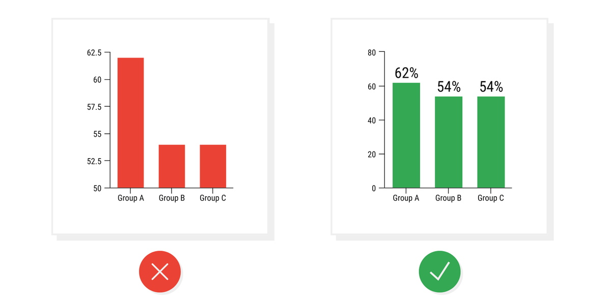 Omitting the BaselineIn most cases, the baseline for a graph should be 0. But people can skew how data is perceived by making the baseline a different number. This can make differences in the data look much bigger or smaller, like below." title="https://abs.twimg.com/emoji/v2/... draggable="false" alt="1️⃣" title="Tastenkappe Ziffer 1" aria-label="Emoji: Tastenkappe Ziffer 1"> Omitting the BaselineIn most cases, the baseline for a graph should be 0. But people can skew how data is perceived by making the baseline a different number. This can make differences in the data look much bigger or smaller, like below." class="img-responsive" style="max-width:100%;"/>
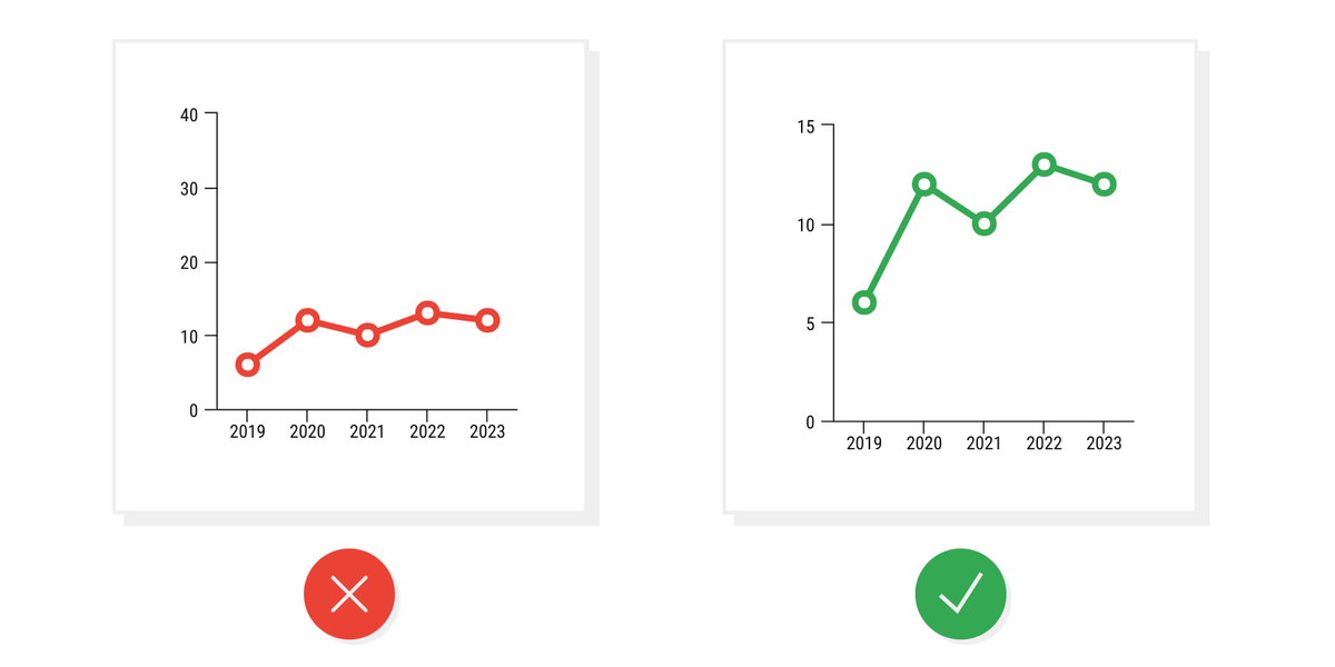 Manipulating the Y-AxisExpanding or compressing the scale of a graph can make changes in data seem more or less significant.This misleading tactic is basically the opposite of omitting the baseline. They& #39;re basically stretching the graph so the data is meaningless." title="https://abs.twimg.com/emoji/v2/... draggable="false" alt="2️⃣" title="Tastenkappe Ziffer 2" aria-label="Emoji: Tastenkappe Ziffer 2"> Manipulating the Y-AxisExpanding or compressing the scale of a graph can make changes in data seem more or less significant.This misleading tactic is basically the opposite of omitting the baseline. They& #39;re basically stretching the graph so the data is meaningless." class="img-responsive" style="max-width:100%;"/>
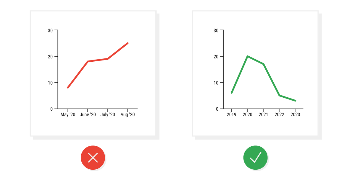 Cherry Picking DataPeople may only include certain data points on their graphs to reinforce their narratives or create a false narrative. When only a certain chunk of data is included in a visual is also called improper extraction." title="https://abs.twimg.com/emoji/v2/... draggable="false" alt="3️⃣" title="Tastenkappe Ziffer 3" aria-label="Emoji: Tastenkappe Ziffer 3"> Cherry Picking DataPeople may only include certain data points on their graphs to reinforce their narratives or create a false narrative. When only a certain chunk of data is included in a visual is also called improper extraction." class="img-responsive" style="max-width:100%;"/>
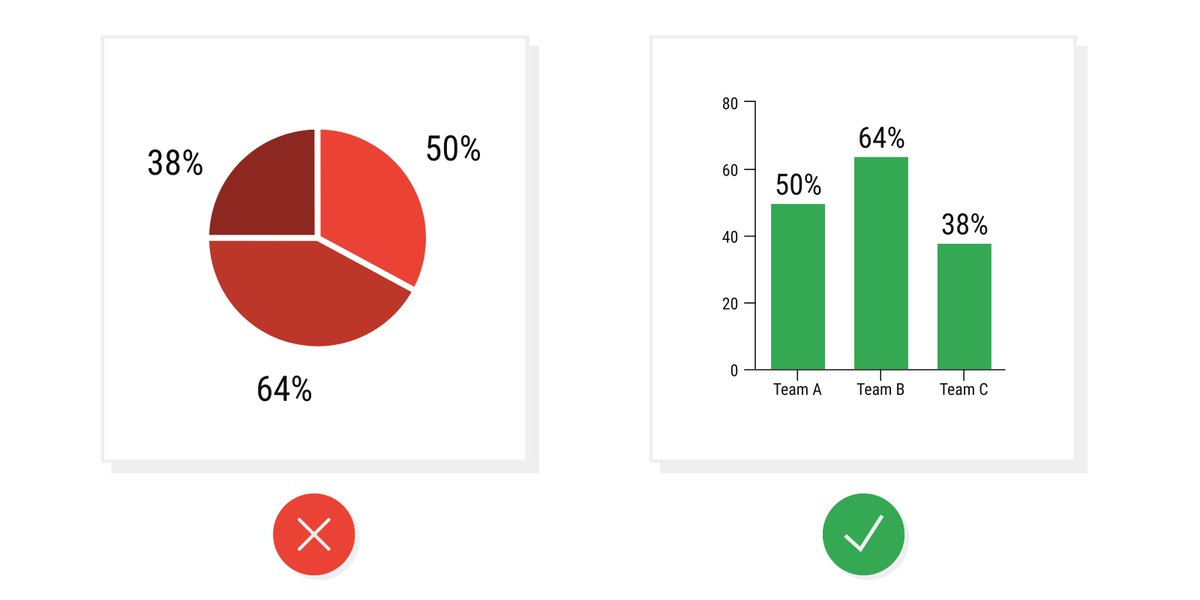 Using the Wrong GraphThe type of graph you use should depend on the type of data you want to visualize.Using the wrong type of graph can skew the data & people will sometimes use the wrong type of graph on purpose to mislead.But most of the time, this is an accident." title="https://abs.twimg.com/emoji/v2/... draggable="false" alt="4️⃣" title="Tastenkappe Ziffer 4" aria-label="Emoji: Tastenkappe Ziffer 4"> Using the Wrong GraphThe type of graph you use should depend on the type of data you want to visualize.Using the wrong type of graph can skew the data & people will sometimes use the wrong type of graph on purpose to mislead.But most of the time, this is an accident." class="img-responsive" style="max-width:100%;"/>
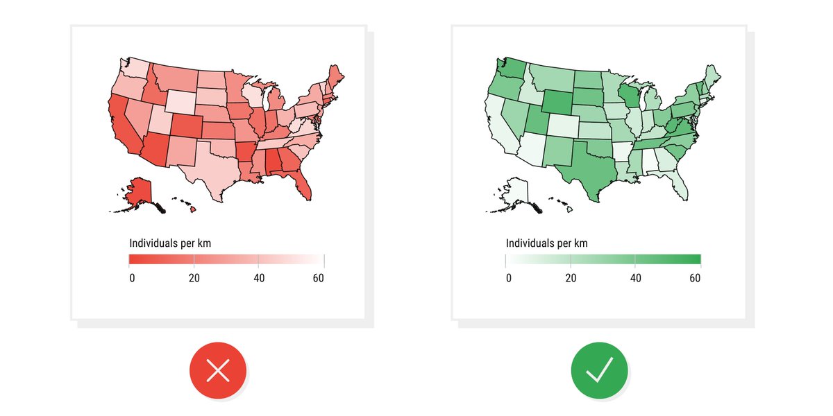 Going Against ConventionsOver time, we have developed standards for how data is visualized. Flipping those conventions can make a graph very misleading to readers.For example, most of the time darker colors mean more of something. But in this bad example, they flipped it." title="https://abs.twimg.com/emoji/v2/... draggable="false" alt="5️⃣" title="Tastenkappe Ziffer 5" aria-label="Emoji: Tastenkappe Ziffer 5">Going Against ConventionsOver time, we have developed standards for how data is visualized. Flipping those conventions can make a graph very misleading to readers.For example, most of the time darker colors mean more of something. But in this bad example, they flipped it." class="img-responsive" style="max-width:100%;"/>


